After babbling about Products People Want to Use I started to work on a shopping list app. Not because I had a strong vision of what I wanted to build, no, only to have something to work on and not lose my momentum.
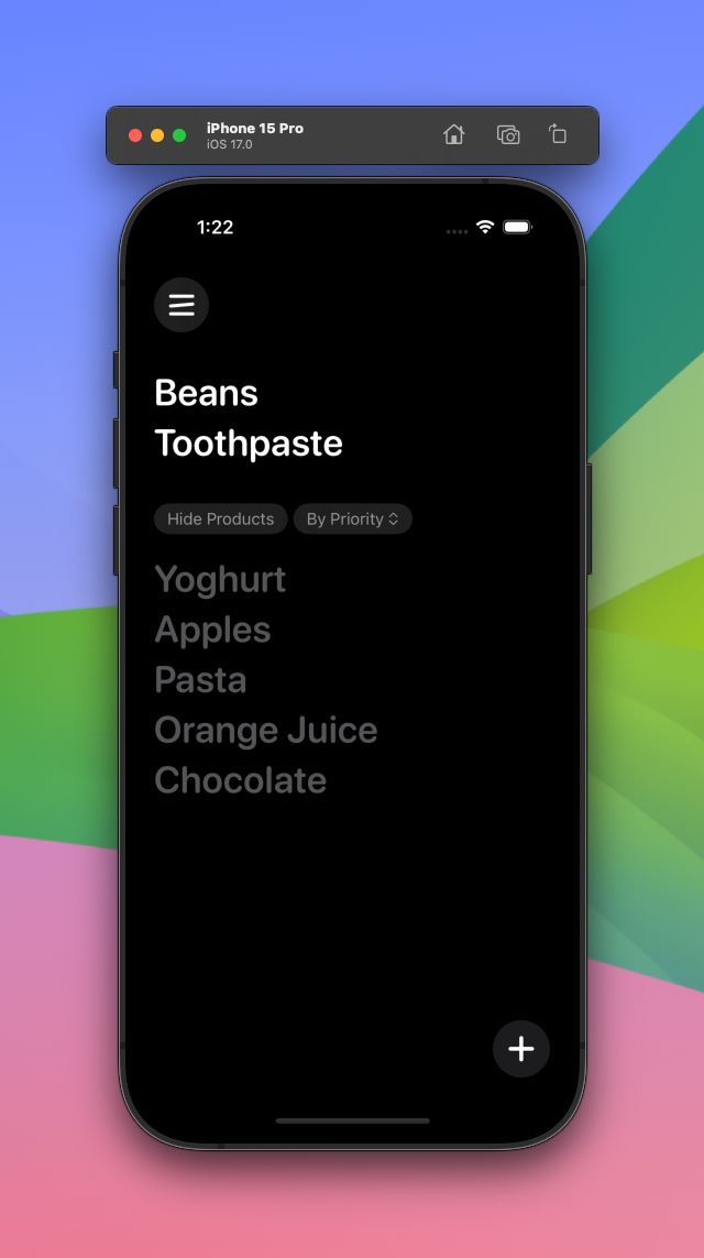
The app, called Zettel, reached an interesting stage I felt was worth sharing. It looks great, it is more or less feature complete and it works, I've used it for all of my recent grocery shopping trips.
There's only one catch: It doesn't feel right. Stanley Kubrick said "The truth of a thing is in the feel of it, not in the think of it." and this is one of those moments. Something about the gestures, the giant tap targets and how adding items works is not right. The vibe is off.
I still have a couple of ideas that will most likely result in a complete redesign of the whole app. Before that happens, I wanted to share the current state for archival purposes.
The onboarding
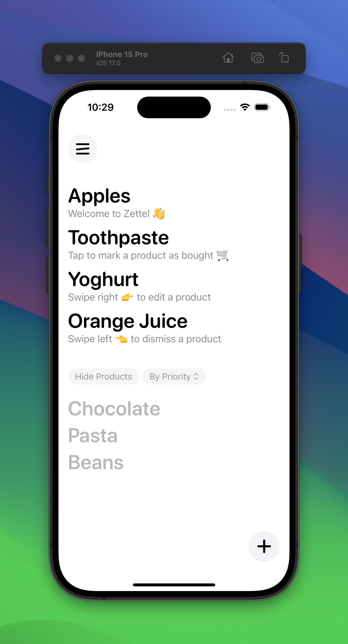
After quite a few iterations (as in: two) I came up with the idea to explain the product and the possible interactions not by slapping on a couple of screens nobody reads anyway but by adding actual products to people's shopping list. I'm using the descriptions to explain possible interactions and to indirectly explain that descriptions are a feature, even though it's not very in your face.

This has a couple of obvious downsides. The most glaring one is that I'm putting items on somebody's shopping list they probably don't want to buy. Not everybody shares my obsession with yoghurt. Except Terry.
Checking off items
This is one of the things I'm a bit proud of in this iteration. Checking off items feels great even though it looks a bit laggy in the simulator. Notice how it waits for the animation to finish until the item moves into the bottom list.
No app worth its salt doesn't have a confetti effect somewhere, so of course Zettel celebrates you finishing your shopping accordingly.
Adding items
This is one of my main issues with this iteration. Initially I thought going through a sorted list of items you buy often is a better experience than typing in the item's name every time. Turns out: I don't use this. Like... at all. I still type. It looks great though!
Typing works as well. If you tap the plus button you can enter some text that filters the list of existing products (and makes it visible if it was previously hidden) or lets you add a completely new product.
This looks amazing, doesn't it? Unfortunately it feels kind of weird, though. A part of that is that SwiftUI's TextField is very slow to become active and it takes up to a second before it shows up for the first time. Another part is—and this is just a guess for now—that this might be over-animated. It looks good but feels "blurry" for a lack of a better word. It feels like throwing jello on pudding. And that's my opinion as a professional product designer.
Removing products you didn't actually buy
One of my primary ideas was to store each purchase to be able to over time accurately predict when you might need yoghurt again. Which is a bad example because of course you buy yoghurt every time you go to the store. This brought me down a dark path of failure and problematic decisions.
The biggest problem: You can't check off items you don't want to buy anymore but didn't actually buy right now or else an inaccurate "purchase" would be stored all calculations would be completely wrong.
So I added an interaction (left swipe on item) to remove products from the list without marking them as bought and an interface to see and edit recent purchases. This is so obviously overengineered that it's not even funny. None of this should be something people have to think about. Disgusting! I'm ashamed of myself.
Again: All of this looks like it would get quite a few likes on X and Dribbble. Unfortunately it's a broken paradigm and needs to be improved.

So, what's next?
I'm not sure yet! I have a few ideas I want to play around with but there's a good chance that I won't be able to create an experience that significantly improves the already available products.
Which is fine, I'm not doing this to become the next big thing in grocery shopping land but to not stop coding.

